The Guggenheim
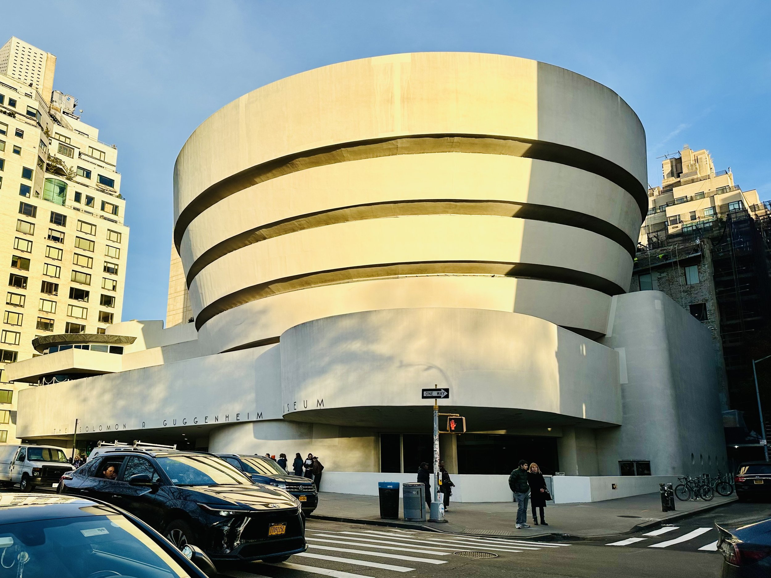
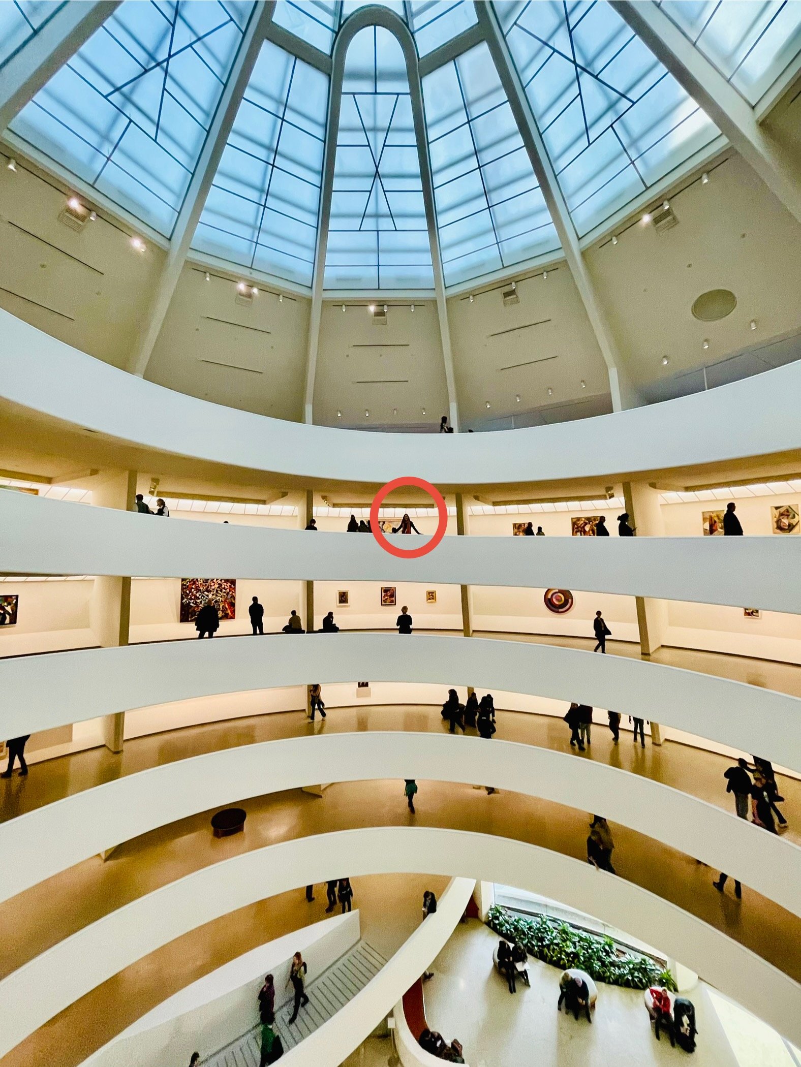
It had been a very long time (perhaps decades?) since we’d visited The Guggenheim New York. So we were long overdue. We had toured Frank Lloyd Wright’s Fallingwater earlier this year, so it was a fine time to explore another of Wright’s masterpieces, The Guggenheim..
In some ways, the Guggenheim (1956) is the opposite of Fallingwater (1936). It’s in an urban setting, not a natural one. It stands out from the cityscape like a monument, rather than blending organically into its surroundings. It was designed to house works of art, not people. But the two iconic structures have plenty in common. They both defied convention and pushed the architectural boundaries of their time. They are both technological innovations of concrete and steel. And they both blur the lines between art and architecture.
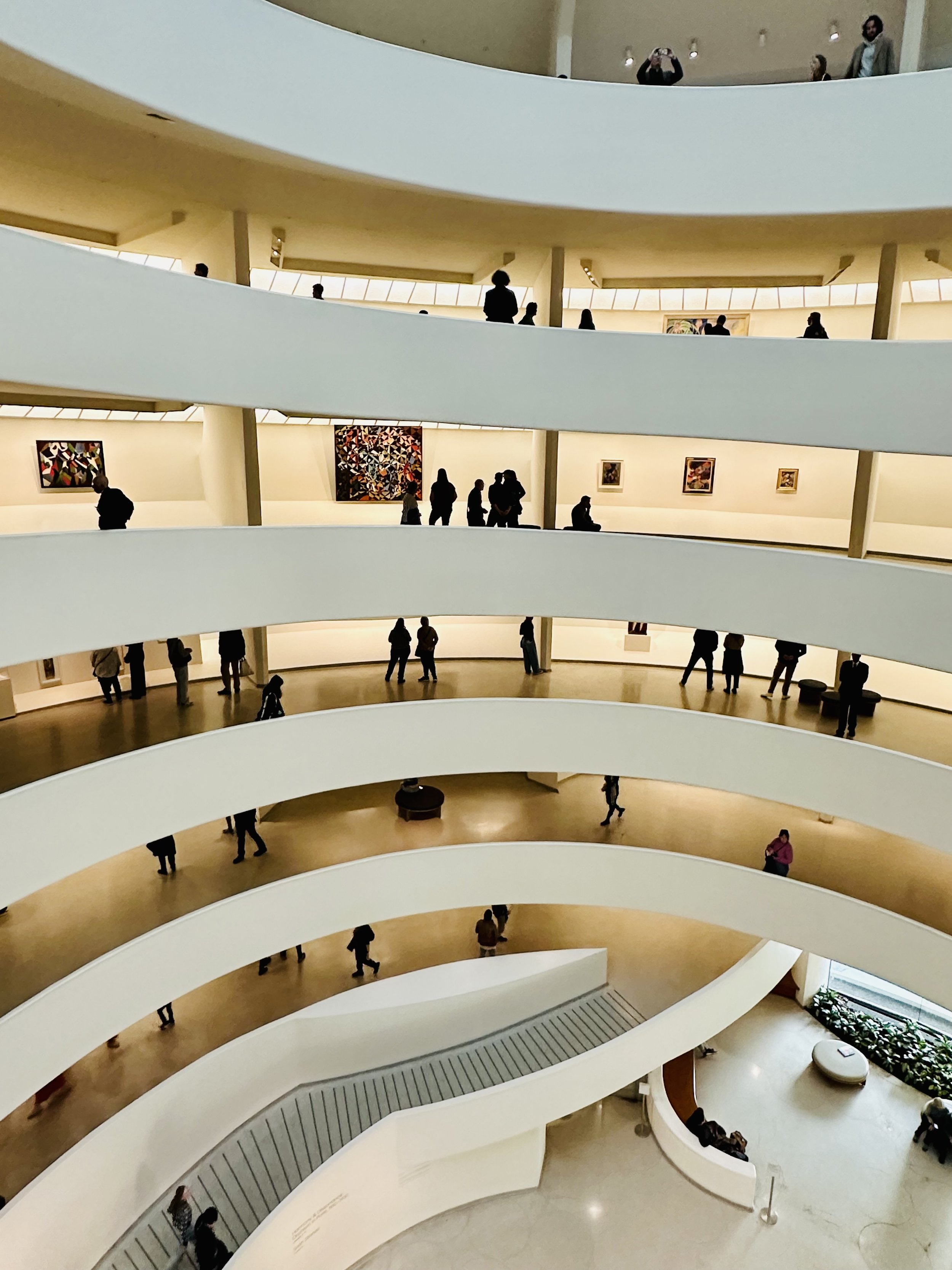
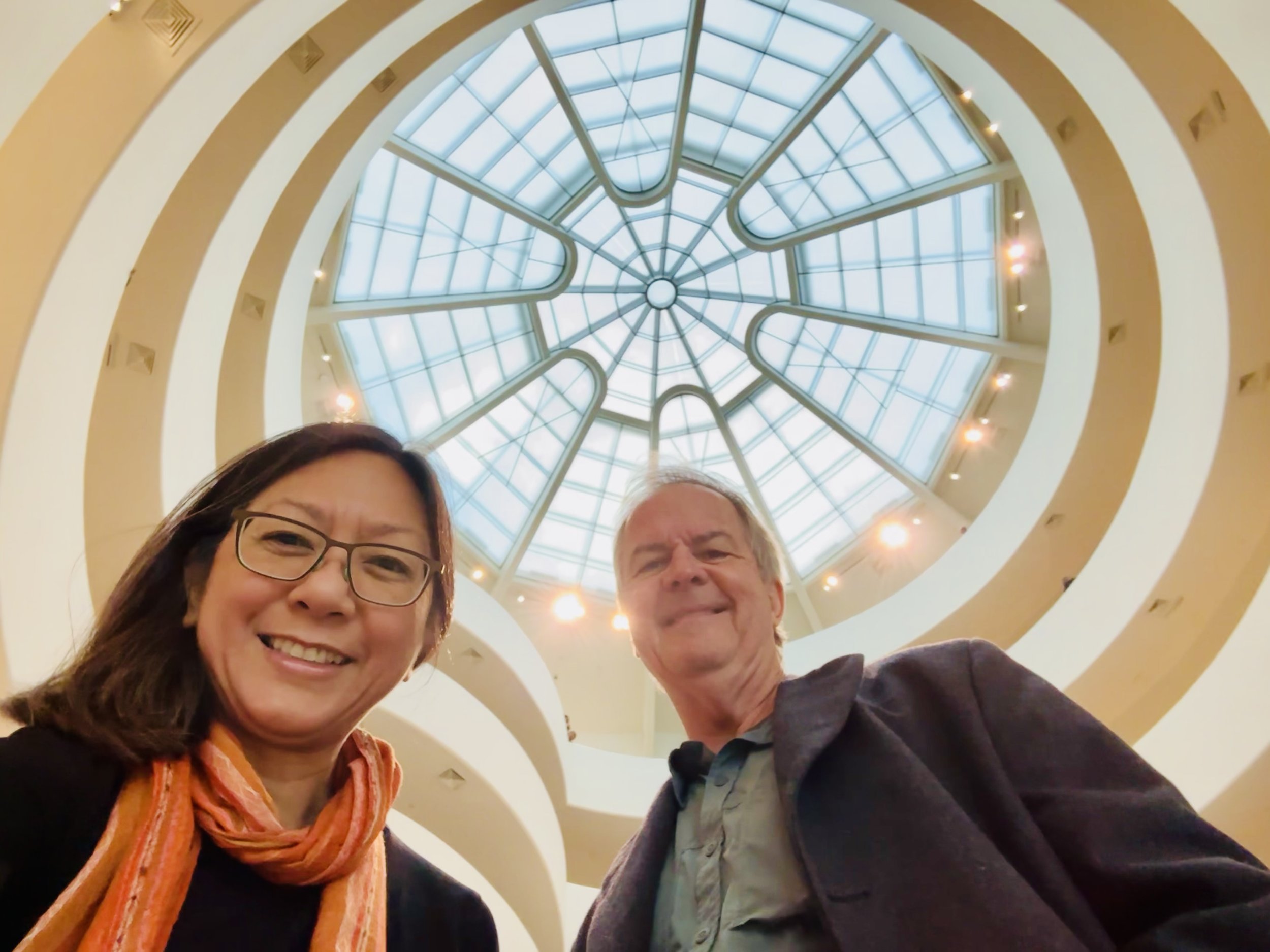
That’s certainly what makes the Guggenheim extra fascinating. Should a building intended to showcase works of art, also be a work of art? As we walked up the wide Guggenheim ramp that spirals nearly 100 feet up to the oculus in the ceiling, it was interesting to note that the flat paintings cast curved shadows. Some long paintings even seemed to curve toward me, looking convex on the concave wall. I know it was an optical illusion, but it also implied that for Wright, the integrity of the building’s design was more important than the optimal display of the artwork within. (Fun fact: Wright intended for visitors to start at the top and walk down, but the elevators are too small to handle the crowds, so exhibits are now designed to be viewed while walking up.)
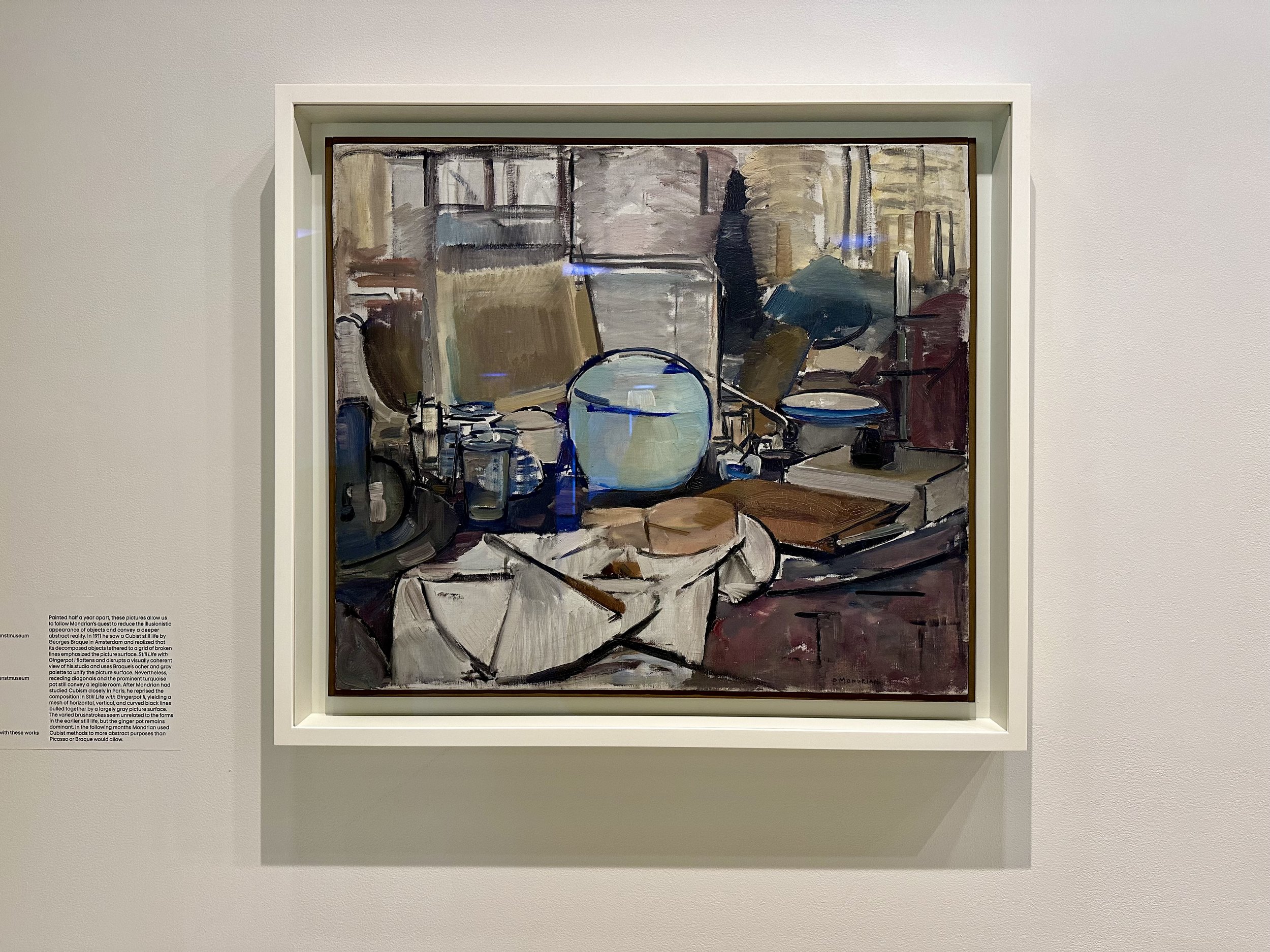
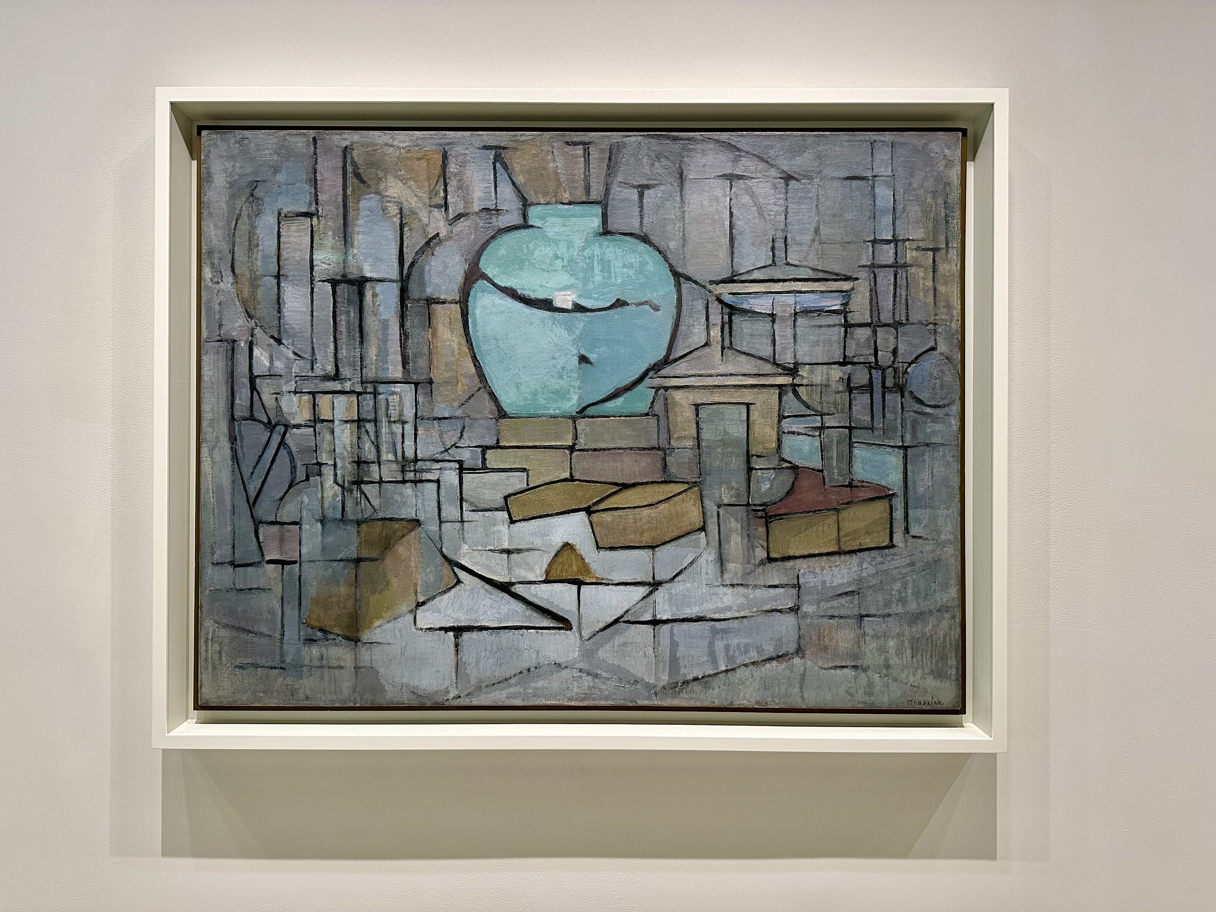
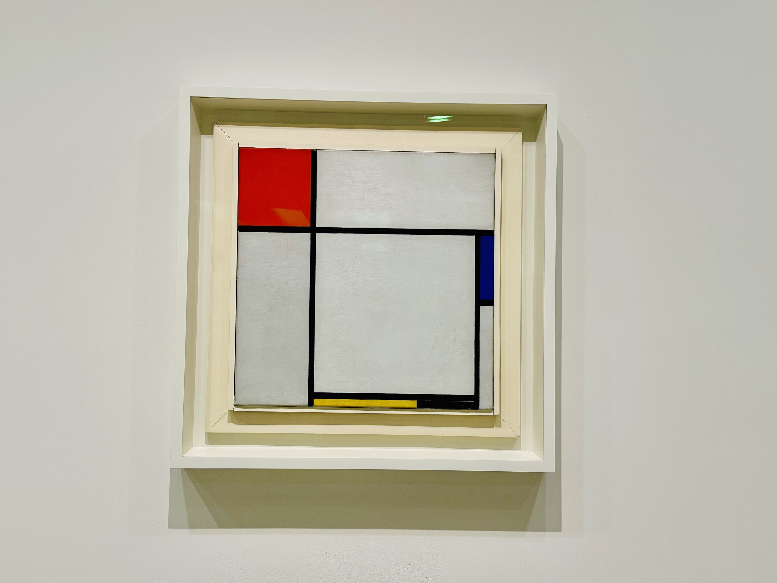
We had timed our visit to coincide with the opening of a new exhibit on Piet Mondrian, who is Steve’s favorite artist. Honestly, the exhibit was disappointingly small. But there were a couple of works that showed the evolution of his distinctive geometric style.
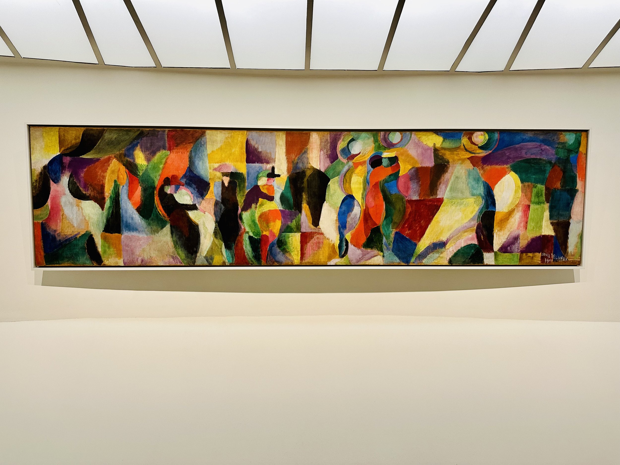
The main exhibit, mounted along the spiral in the rotunda, was titled Harmony and Dissonance: Orphism in Paris. Showcasing the work of artists like Robert Delaunay, Sonia Delaunay, and Marc Chagall, it explored the influence of dance, music, and poetry on art in early 20th century Paris. I especially enjoyed the vibrant colors and the many different interpretations of the Eiffel Tower.
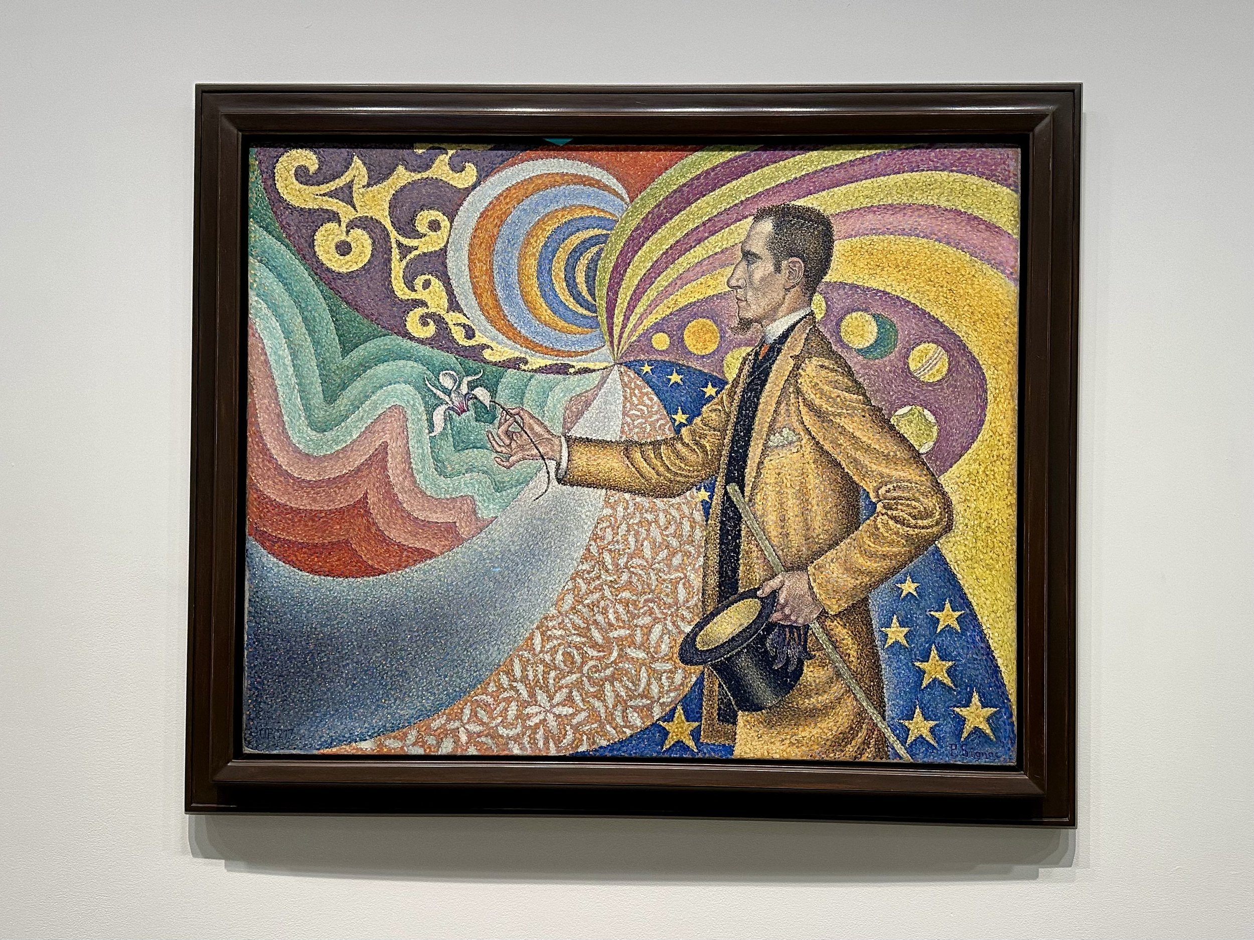
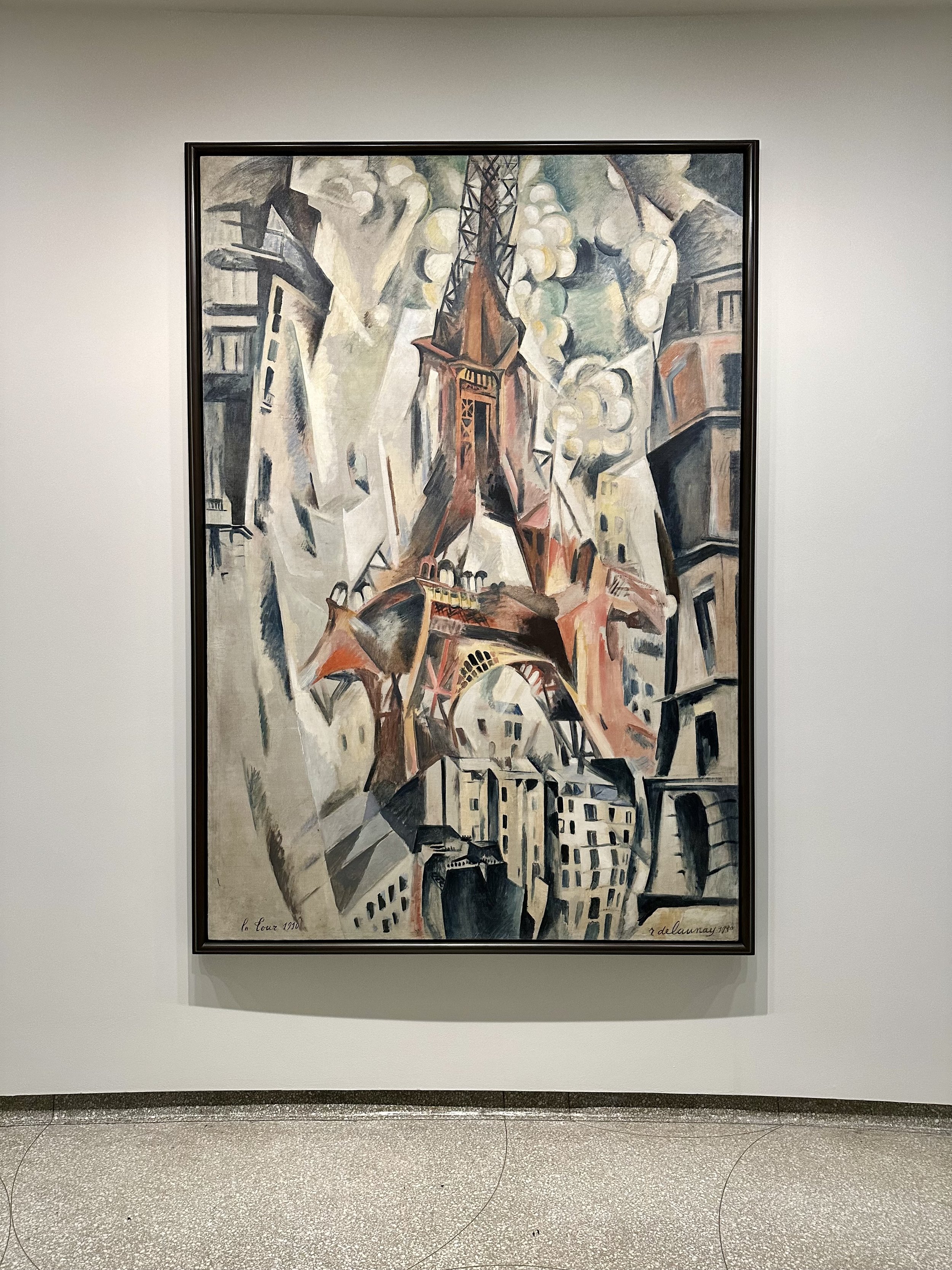
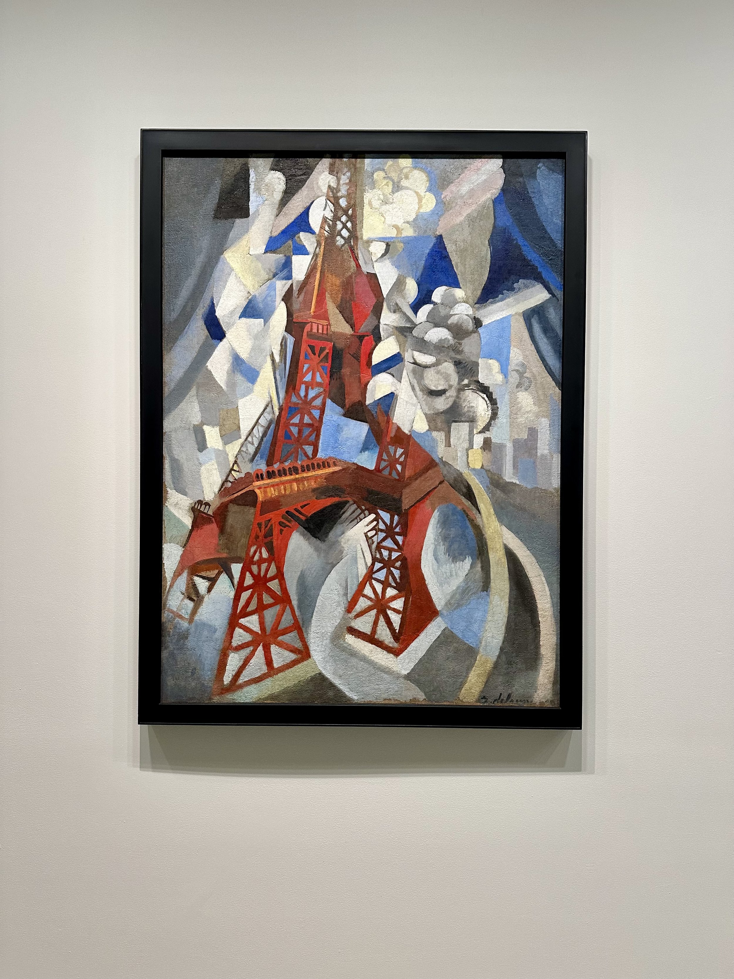
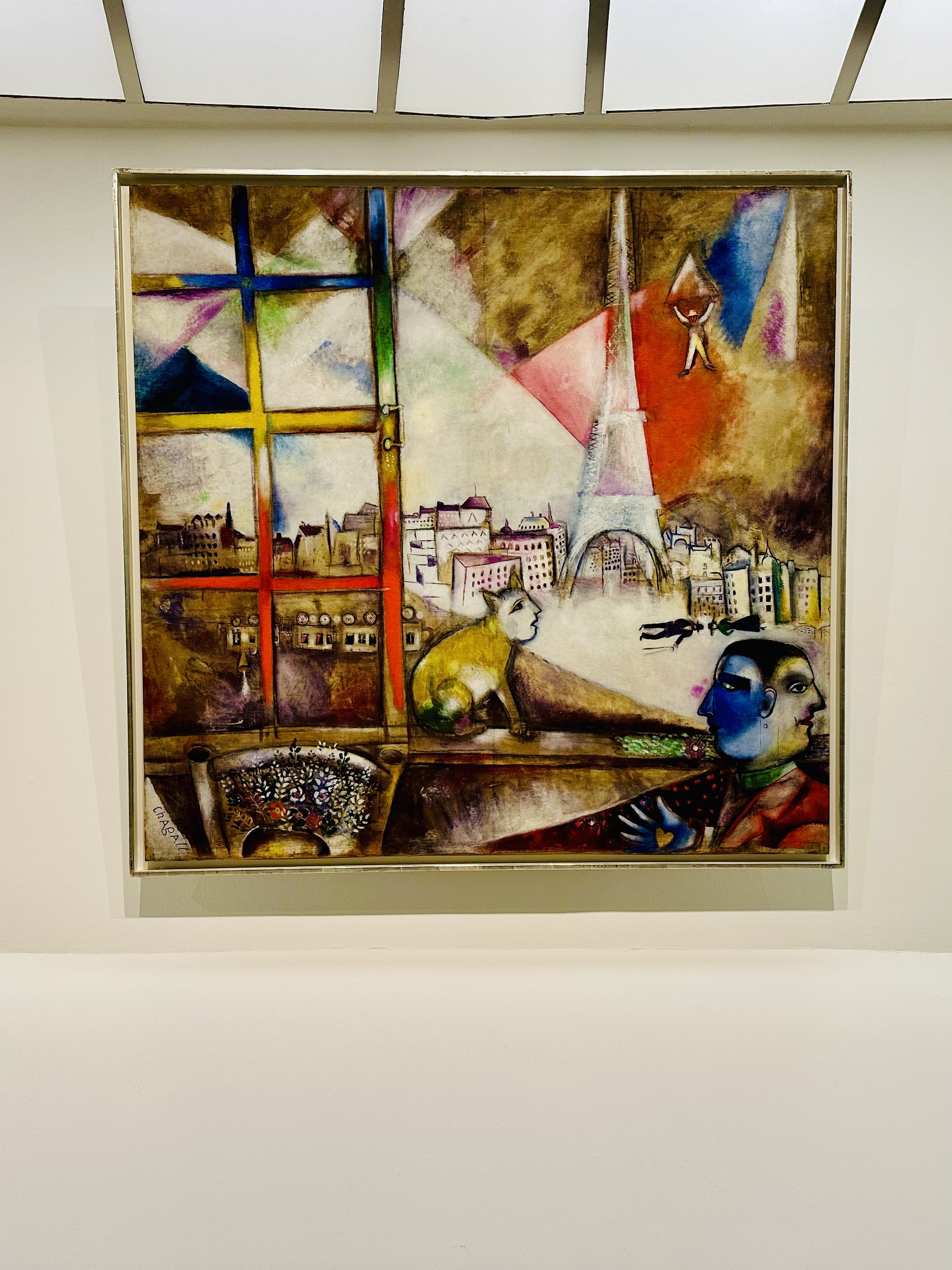
In a side gallery with selections from the Guggenheim’s impressive permanent collection, there was a piece I found especially intriguing. It was a huge landscape by Camille Pissaro, depicting a village outside Paris. Oh, it was luminous. I wanted to be in that painting, to walk along that path and feel the sunshine. It was a chilly winter day in New York, and that image of a sunny day in France was so large and vibrant that it made me feel warm. Interestingly, this painting was considered vulgar by critics of its time, because it presented working-class people in a rural scene, on a scale normally reserved for historically significant subject matter. That irony brought this to mind: for us ordinary folk, the people and places around us are important, and worthy of being immortalized - in a grand painting, or maybe in a humble blog.
